How we create a cross-border payment gateway that's user-friendly for businesses?
In 2021, OwlTing Group introduced OwlPay.
OwlPay is a payment solution product. Regardless of business size, OwlPay offers suitable B2B cross-border payment solutions. Its global payment network allows businesses to effortlessly make international transfers. Companies have the option to pay using local currency or stablecoins.
So, how was this product developed?
This article will present the OwlPay design team's perspective, sharing their journey from 0 to 1 in building OwlPay.
We will focus on sharing across 4 main topics:
- The design tools used by the OwlPay design team
- The design principles of OwlPay
- How the OwlPay design team collaborates with other members
- Challenges faced by the OwlPay design team and how they overcame them
Topic 1. The design tools used by the OwlPay design team
The OwlPay design team adopted Figma as our design tool.
Past design struggles
OwlPay's UI/UX Leader - 500 said:
We chose Figma in order to enhance our design workflow efficiency.
Previously, the design team used Sketch and Zeplin to design product wireframes and prototypes. However, they encountered 3 main issues during the process:
- Large Files: Since Sketch operates as a standalone design software, transferring design drafts to front-end developers required the additional tool, Zeplin. As projects progressed, Zeplin files became larger and larger, causing long load times that hampered everyday design and development tasks.
- Difficult Operations: Zeplin uses a page-by-page viewing logic, unlike Figma which designs on a canvas. Navigating Zeplin felt akin to browsing a Word document, which was counter-intuitive.
- File Loss: Earlier versions of Sketch didn't have cloud capabilities, leading to the potential loss of design files if not saved properly.

This brought much anguish to the design team, prompting them to seek alternative solutions.
Ultimately, they discovered Figma.
Three benefits brought by Figma
Figma was introduced as a new product in September 2016.
Although it was launched 6 years after Sketch, Figma effectively addressed the pain points of the design team.
The benefits of using Figma include:
Benefit 1. Enhanced collaboration
- Speeding up team understanding: Designers can utilize the Prototype function in Figma, linking page designs with a "drag line" to streamline the operation flow, which in turn increases the fluidity and success rate of proposals. Front-end developers gain a clear visual understanding of the user interface, facilitating development.
- Convenient commenting function: Product teams can use Figma's Comment feature to leave suggestions on specific screens. Moreover, Figma supports whiteboard chats, allowing teams to collaborate online and discuss individual design elements in detail.
- Intuitive operation screens: Previously, teams could only navigate Zeplin page-by-page, making it hard to grasp the full context and impact of designs. With Figma, members can freely browse the interactions between processes. For front-end developers, they can visualize all UI changes at once, enabling a holistic development approach.
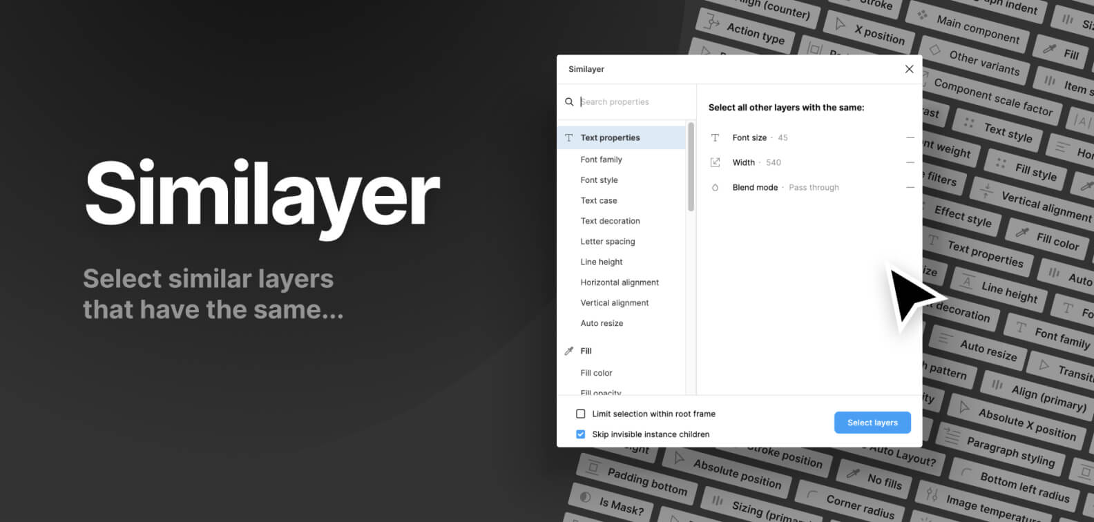
Benefit 2. Open-source community
Figma boasts a vast open-source community, files, and plugins. It also permits users to upload and develop their own plugins.
Designers can utilize plugins to boost their work efficiency.
For instance, the Similayer plugin offers multi-filter features (like color fill, lines, fonts, rounded corners, effects, etc.) allowing designers to select objects of the same style across different layers, even locked ones, to quickly edit.
Benefit 3. Cloud-based tool
Being a SaaS tool, Figma ensures that designers don't have to fret over computer specifications or file storage capacity.
This effectively resolves past challenges where designers had to send Sketch files back and forth, circumventing design issues caused by mismatched Sketch versions.
Therefore, when OwlTing was gearing up to develop their new product, OwlPay, the design team promptly chose Figma as their primary design tool.
Topic 2. The design principles of OwlPay
"When planning, think not just of the present issue, but also of the future scalability of the feature."
OwlPay UI/UX Designer - 500
OwlPay is just one of the products within the OwlTing Group.
Given the diversity in the company's business model, there's potential for common functionalities across different products if they offer business value.
Hence, in design, it's crucial to consider the future scalability of OwlPay's functionalities.
But how can one achieve this?
The answer is: By establishing Design Principles.
Implementing design principles
OwlPay's UI/UX Designer, 500, mentioned:
"In the early stages of design, we didn’t focus much on creating UI Components, which made maintenance cumbersome.
But with accumulating work experience, we started to recognize its importance.
In large systems, many components get reused, so it’s vital to ensure their consistency."
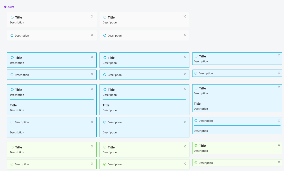
The purpose of defining design principles is to determine what kind of user experience the "product" aims to offer.
For instance, in interface design, the entire product system should maintain a consistent color tone.
To achieve this, the design team turns frequently used design elements into "Design Components", reducing the hassle of future modifications.
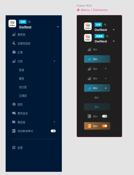
Take the "Button" design component as an example:
- During design, there are buttons of various sizes, categorized based on their importance on the page.
- For instance, the most crucial actions are designed as big buttons, regular settings as medium buttons, and the least important actions as small buttons.
"Design Components" enhance the design’s scalability, allowing designers to freely assemble existing components as per requirements.
For example, after adding circles, buttons, and icons to design components, designers can create a "Notification" feature.
Using UI components ensures design consistency, preventing massive page edits when modifications are needed, thereby significantly reducing the design maintenance cost for designers.
What to consider when using Design Principles?
Before designing, consider the development framework used by frontend engineers and whether to use that framework's UI Kit.
For instance, OwlPay's frontend engineers adopted the Ant Design framework, leading the designers to use Ant Design's UI Kit, cutting down the time engineers need to customize UI elements.
How does OwlPay manage the structure of Components?
Currently, OwlPay's design team classifies Components mainly into three types.
Type #1. UI component
The smallest unit components, such as titles, texts, and buttons.
Type #2. Component
Components made up of UI Components, like Breadcrumb (page path) and Menu (left sidebar).
Type #3. Icon component
Expandable components, such as Tooltip (suggestion tips) and Completion status.
When it comes to Component colors, the design team is meticulous about naming color codes.
"Color code" refers to the color of a design element. For instance, OwlPay’s main visual color code uses #f46f56 orange as its brand color.
"When naming color codes, they should be named functionally," says 500.
For example, when designing button colors:
- Green: signifies Success
- Yellow: signifies Warning
- Red: signifies Failed
Naming the color codes "functionally" ensures design consistency.
Topic 3: How the owlpay design team collaborates with other members
How do OwlPay's design and development teams communicate and sync regularly?
The OwlPay product team adopts the Scrum methodology.
- Standup meeting: Everyone has 3 minutes to quickly state (1) what I did yesterday, (2) what I will do today, and (3) any assistance I need.
- Design review meeting: Regularly proposing new features, inviting front-end engineers, back-end engineers, technical writers, and the Product Owner to discuss UI and functionalities designed for this Sprint. If there are any doubts or concerns, modifications must be made before it enters the Sprint Meeting for development.
- Design internal meeting: The design team syncs up on each other's work status, ensuring that the current design tasks align with the team's development timeline.
To ensure consistency between design and development, what tools does OwlPay use to communicate with the development team?
They primarily collaborate using Figma.
The advantages of using Figma are:
- Easy annotation: Designers or team members can use the Comment feature to request specific roles to modify or review UI content.
- Easy navigation: Figma offers a unique feature called Spotlight. By clicking on a specific team member's avatar, the screen will automatically follow that member, facilitating team discussions. (ref
- File links: In Figma, each design element has a unique link. Team members can share this link, allowing specific individuals to directly open Figma and focus on that element.
How does the design team identify and clarify user requirements?
What users need often differs from what they verbalize.
For instance, the finance team suggested that the payout order information on the OwlPay system was insufficient and should be redesigned. However, after interviews conducted by the designers, it was revealed that the UI's payment information differed from the financial statements they were accustomed to.
- Original Design: Payment information summed from left to right.
- What Finance was Familiar With: Payment information summed from top to bottom.
Thus, the issue wasn't a lack of information but a disparity between the UI design and the user's familiar interface.
OwlPay designer - 500 mentioned:
When uncovering the real needs of customers, it's not just about listening to their direct demands.
It's more about understanding their true intent. For example, discerning the actual problem they want to address from the issues they raise.
Taking the above case as an example, we modified the payment information presentation based on the finance team's suggestion, which effectively addressed their concerns.
Topic 4: Challenges faced by the OwlPay Design Team and their solutions
OwlPay is a payment product that handles financial transactions, and its complexity is much higher than most SaaS products.
For instance, the OwlPay design team had to overcome challenges such as:
- Understanding the operating rules of cash flow and information flow from a wide range of unfamiliar financial partners in order to develop appropriate user workflows.
- When it comes to financial operation functions, users across various companies and industries have different habits and practices.
Both of these challenges required the design team to invest a significant amount of time studying the product to design a user interface that met the needs of its users.
500 recalled:
Take the previously mentioned "payment bill" as an example. Initially, it was a simple requirement - just display the payment amount, payer, payee, and payment time.
But as the functionality became more complex, this interface had to incorporate increasingly more information, such as exchange rates, the process of calculating those rates, payment methods, and so on.
This necessitated designers to continually iterate and adjust the product.
Based on this experience, he offered a crucial tip for budding designers: at the onset of product design, work closely with the product team to define user personas.
Whether it's through user research or collecting feedback across departments, it's vital to enable the team to collaboratively discuss "who our product's customers are."
When product team members can frequently discuss customers, they'll have a clearer picture of the user persona.
This way, when discussing requirements, team members can focus on whether a particular requirement meets the needs of the target user, avoiding the design of impractical features based on mere assumptions.